5 Why these trends?
5.1 Affordable housing, homelessness, and evictions
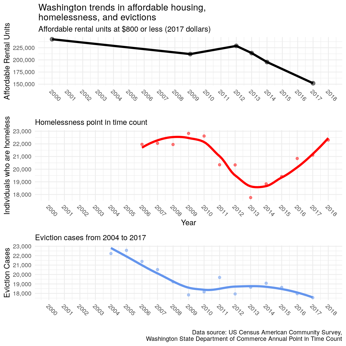
Figure 5.1: Trends in affordable housing, homelessness, and evictions for Washington State
The above figure shows Washington’s trends in affordable housing units at $800, changes in homelessness according to the yearly point in time counts, and and the trend in eviction cases. Overall, we see that around the Great Recession, there was a high rate of homelessness and evictions even when there was more affordable housing. This corresponds with the overall economic crisis at that time where a large proportion of all households faced huge economic disadvantages. After the recovery from the recession, affordable units slightly increased along with declines in homelessness and evictions. However, by 2012, Washington started to lose affordable housing largely to rising rents, where the following year started an increase in homelessness. During this time, evictions kept a steady pace until about 2014 where it started to slump while homelessness took a drastic rise. By 2017, we lost a large portion of affordable housing stock, see homelessness increasing beyond Great Recession numbers, and evictions keeping a steady pace since 2009. It should be noted that while evictions seem down, there are still over 18,000 cases, only a few percentage points down from eight years before.
Given that evictions contributes to homelessness,35 36 37 the steady stream of evictions likely fed people into the homeless population each year while the loss of affordable housing exacerbated the problem. In contrast to the Great Recession, where almost all households felt the economic crisis, the period between 2012 to 2017 seems to have largely impacted low-income households that may not have recovered from losses during the Great Recession. In other words, our overall growing economy over the past eight years may have concealed the danger of housing insecurity among the most vulnerable Washington citizens. Surveys during the point in time count show that each year, over 90% of those counted were from Washington State38 meaning that our homeless population is largely our own people and the myth of the migrant homeless doesn’t hold up. Rather, the Urban Institute Study39 referring to a connection between decreasing evictions and affordable housing as a result of losing low-income households seems to be a likely relationship for Washington as well. In our case, we seem to have fewer households to evict possibly because they have entered into homelessness.
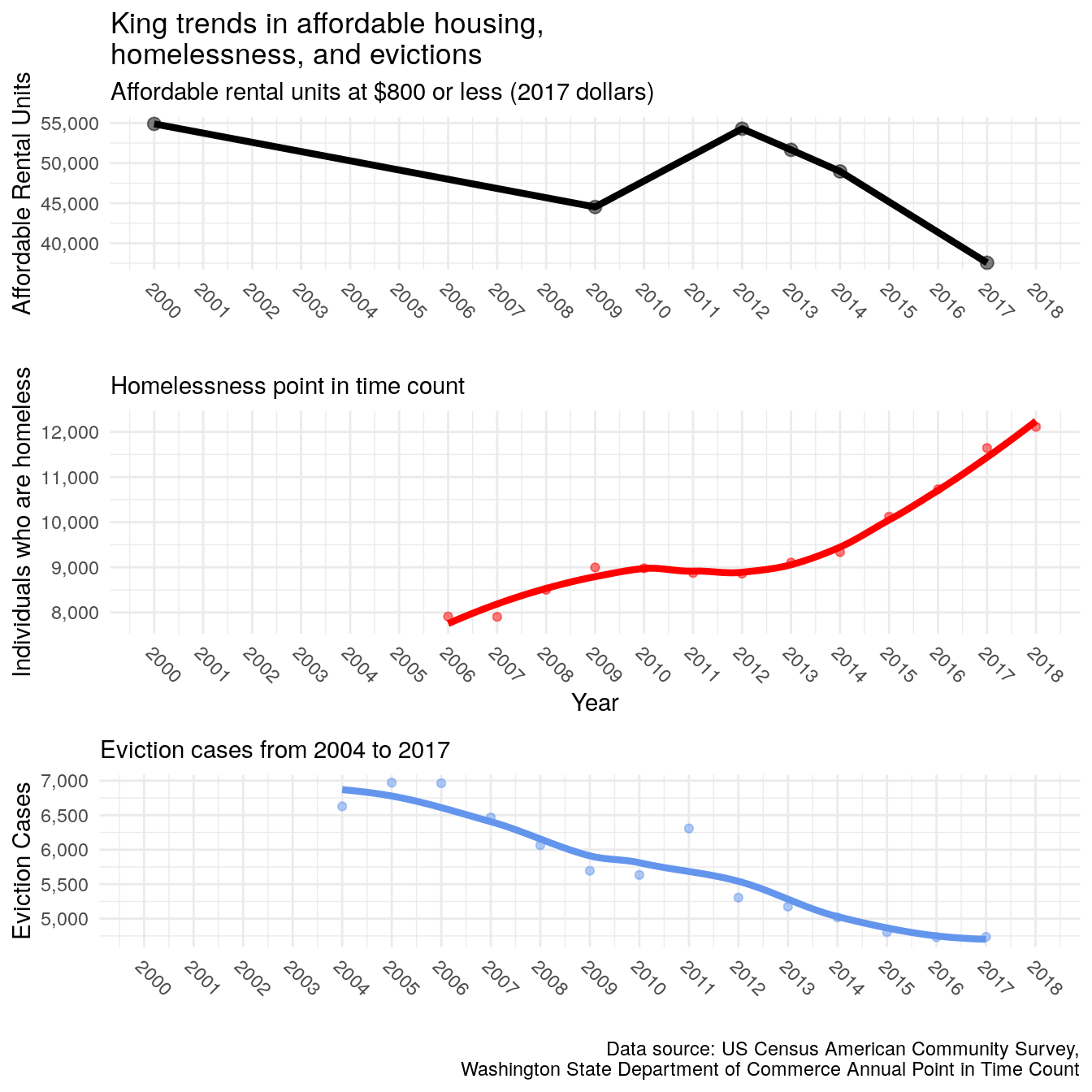
Figure 5.2: Trends in affordable housing, homelessness, and evictions for King County
When we look solely at King County (above), we see a more pronounced relationship in the decline in evictions and affordable housing along with a rapid increase in homelessness. On a more micro-level, the loss of affordable housing coincides with a decline in evictions because tenants who are evicted face a difficult time finding new housing due to their record and limited incomes that cannot afford the fair market rental rates.40 Even for tenants with a public housing voucher, finding an available unit is extremely difficult and few landlords even accept vouchers.41 With few housing options for evicted tenants, it is likely that a majority of these households are either geographically displaced or forced into homelessness.
Based on prior research that finds a direct link between evictions and homelessness through qualitative surveys and our quantitative examination of trends in the state, it is becoming increasingly evident that evictions seems to be one of the direct mechanism between the current housing crisis and increases in homelessness. A recent McKinsey report says that
“[t]he rise in homelessness cannot be explained by population growth or rising poverty, as there has been little of the former, and the latter has fallen.” 42
meaning that other mechanisms are at play. While the McKinsey report finds a correlation between the rise in homelessness and the rise in fair-market rent, our report seems to add evictions into this equation.
5.2 46% of WA renters are rent burdened
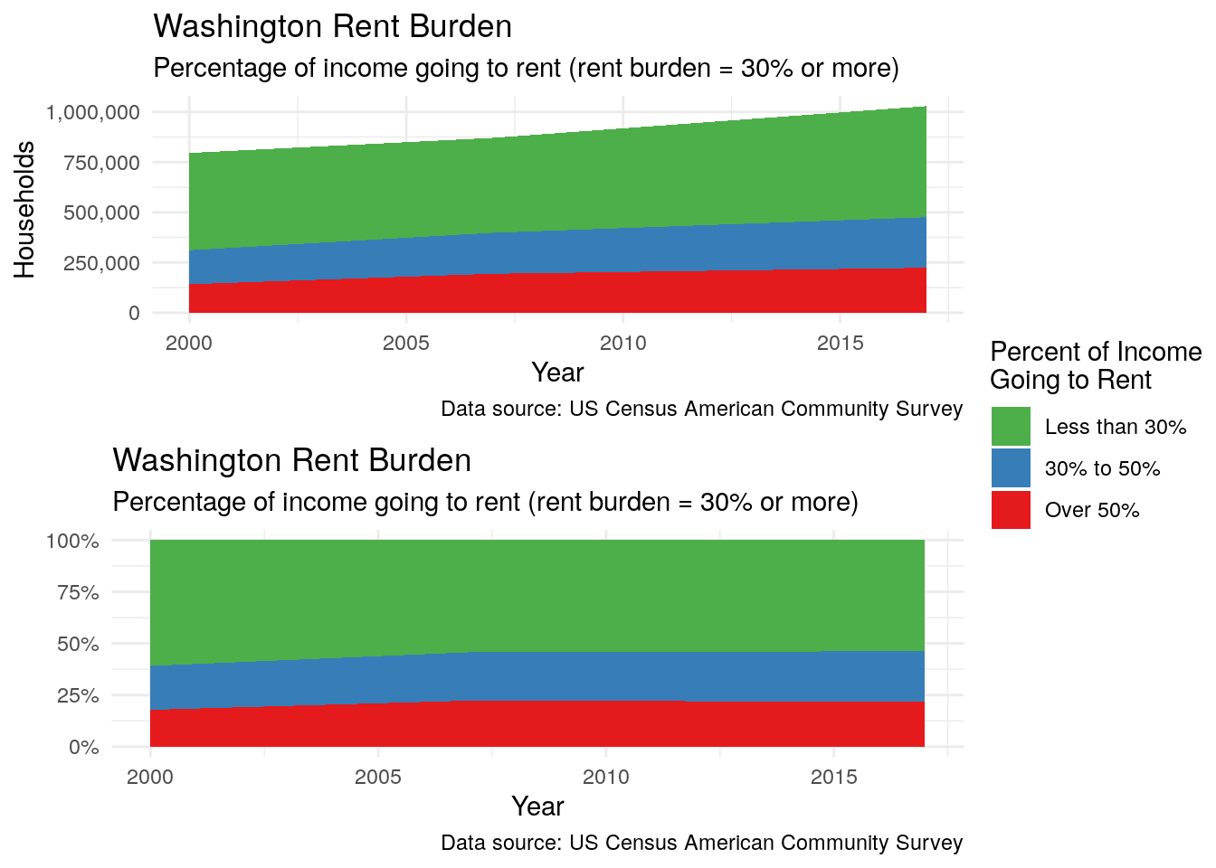
Figure 5.3: Rent Burden: the percent of household income going to rent
Almost half of all renters (46%) are rent burdened. Of those households, close to half of them are paying more than 50% of their income to rent. This means that about 250,000 households are paying between 30% to 50% of their income to rent and another 250,000 are paying over half their income to rent–a combined total of 500,000 households. This leaves a large portion of the population near the brink of losing their homes.
5.3 FMR rent and RB incomes
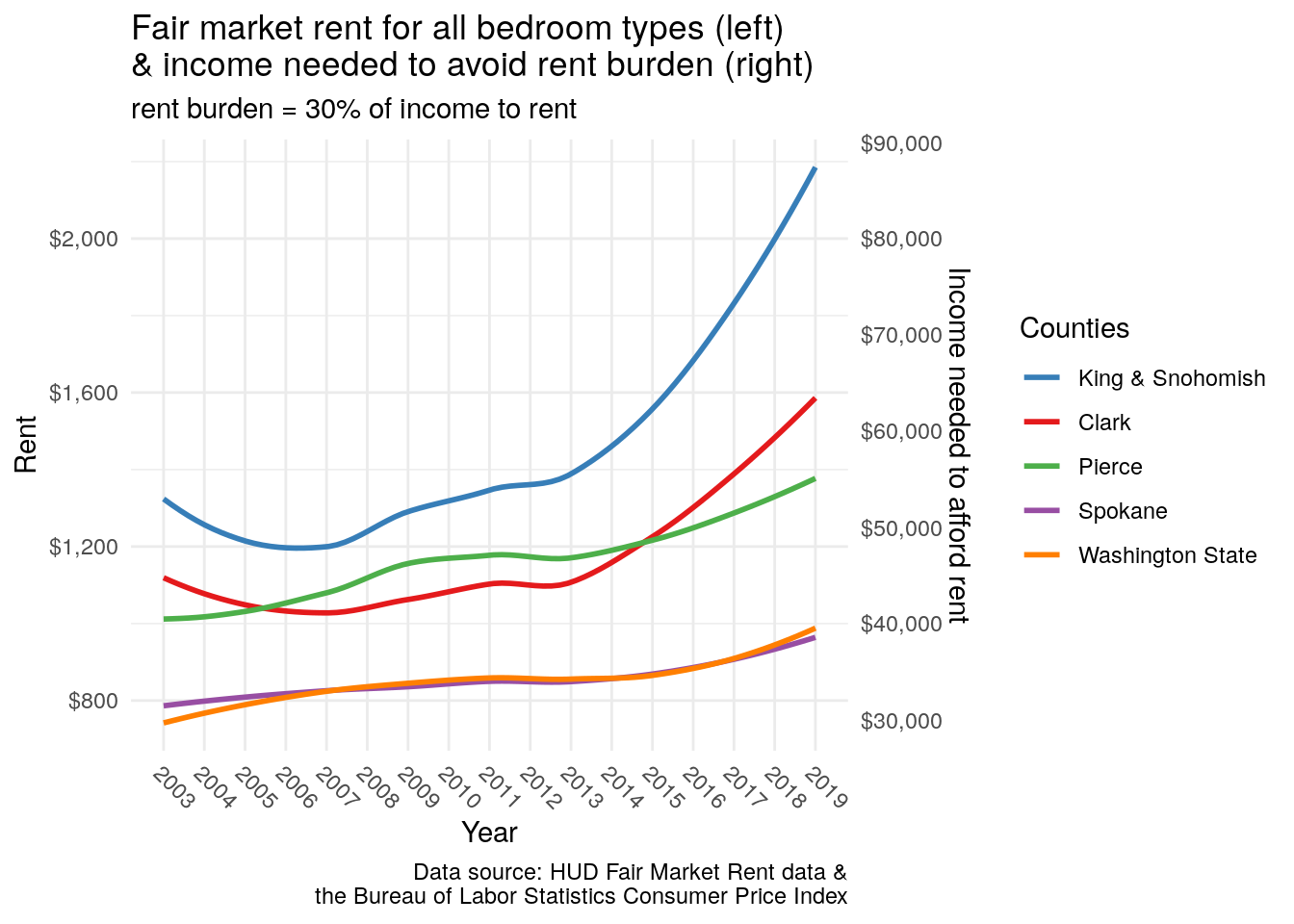
Figure 5.4: Rents and incomes need to afford rent
Figure 5.4 above shows the going rents across the state and within the top five most populated counties. On the left-hand side is the HUD fair market rent43 adjusted for 2017 dollars. Washington (the orange line) had rents under $80044 in 2003 and saw an average increase to $1,000. When calculating how much income is needed to avoid 30% rent burden,45 $1,000 rent requires an income of $40,000 after taxes. Overall, you can seen that, again, in 2012, rents started to sharply increase in the most populated counties. In King, you need about $90,000 after taxes to afford the conservative estimate $2,200 in rent. In Clark, you need about $65,000 while in Pierce, you need about $55,000.
5.4 Median household incomes by race
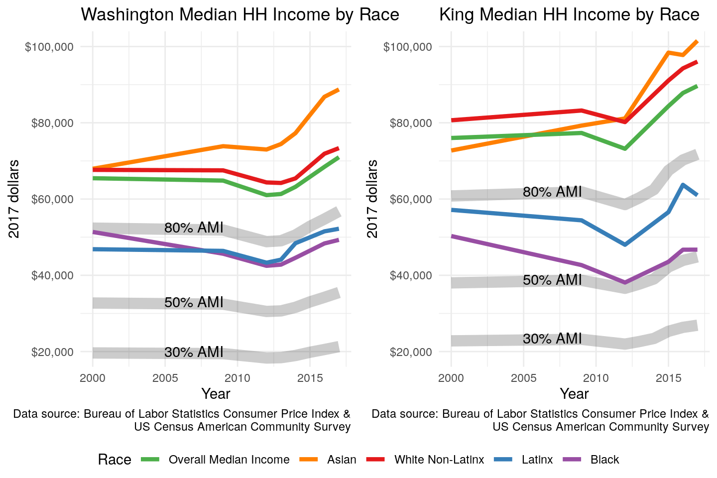
Figure 5.5: Median Household Income by Race and Area Median Income
Finally, when looking at incomes by race (Figure 5.5 above) there are distinctions between different groups. For Washington State (left graph) the overall median household income (green) took a hit during the recession but recovered to about $70,000. By median, we mean that half of the population is above $70,000 and half are below. White median household incomes fall just above the overall median while Asian increased well above reaching upwards of $90,000. Black and Latinx, however, fall below the 80% area median income (AMI) line which signifies “low-income”. Fifty percent signifies very-low-income and 30% signifies extremely-low-income.46 The right graph shows King County where the overall median falls near white and Asian incomes while Latinx households are just below the low-income threshold and black median incomes are just above the very-low-income threshold. The legacy of segregation in has largely contributed to the consistently low incomes for black and Latinx households where redlining, block-busting, and housing covenants disallowed lending to households of color and access to segregated white neighborhoods that saw improved conditions.
Crane, Maureen, and Anthony M. Warnes. “Evictions and prolonged homelessness.” Housing studies 15, no. 5 (2000): 757-773.↩
Desmond, Matthew. “Eviction and the reproduction of urban poverty.” American Journal of Sociology 118, no. 1 (2012): 88-133.↩
Desmond, Matthew. “Eviction and the reproduction of urban poverty.” American Journal of Sociology 118, no. 1 (2012): 88-133.↩
A Pilot Study of Landlord Acceptance of Housing Choice Vouchers↩
Rent data is difficult to calculate and no one institution or group has the best data on it. The US Census provides an estimate but it is severally under-estimated while companies like Zillow and Redfin provide highly over-estimated rents because they tend oversample luxury and high-cost apartments. The US Department of Housing and Urban Development (HUD) provides a good middle ground that factors in several datasets and is the primary tool to determine fair market rent (FMR) values for their housing voucher recipients. For these reasons, we use HUD’s FMR as our cost of rent.↩
Averaged rent for all bedroom types.↩
\(income\;needed = (rent \cdot 12 months)/.30\) ↩
These AMI cutoffs were developed by the Housing and Urban Development Department to determine thresholds necessary for housing choice vouchers.↩